I'm not going to say that there aren't enough graphs in the world. I there are probably too many, in fact. They are, frankly used to obscure information as much as illuminate it. I obviously can't change that in a day (or at all for that matter); all I can do is use well here and let the rest fall where it does.

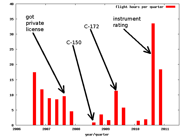
This is a graph of my flying time since I started in 2006. The spot marked "C-150" is when I got signed off to fly my club's Cessna 150 and likewise with it's Cessna 172. I like that in the last two years the trend is sharply up. :-)