Site Navigation:
Craig's twitter feed:
I have a compulsion--probably mostly from my scientific training. I like to visualize data. I think that looking at a graph is much more compelling than looking at a series of numbers.
In that vein, I've plotted the number of hours of I've flown per quarter before. The last time I tried to generate a new version of that graph, I couldn't figure out the sequence of gnuplot commands to make the graph work right. I've found it again, so here's the up-to-the day current graph for my flying, and also the commands used to create it.
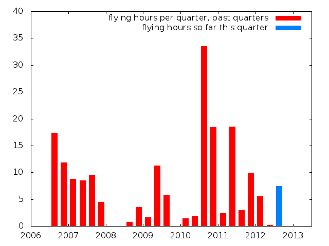
Here's the gnuplot session used to create that graph:
gnuplot> set xrange [2006:2013.5]
gnuplot> set yrange [*:40]
gnuplot> set boxwidth .15
gnuplot> plot './hours_flown_quarters.dat' with boxes fs solid title 'flying hours per quarter, past quarters', './hours_current_quarter.dat' with boxes fs solid lc 3 title 'flying hours so far this quarter'